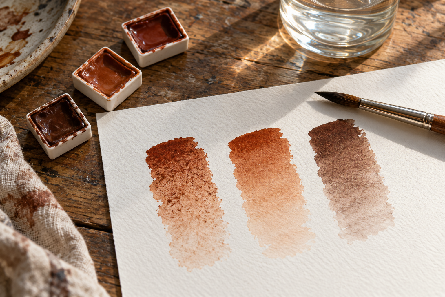
Three tubes marked Burnt Sienna can sit in the same paint box without holding the same coloured material. One maker can use a single synthetic iron oxide, another an earth pigment, and a third a mixture. The names are familiar because they describe a useful family of reddish browns. They do not promise identical ingredients, identical washes, or identical marks on paper. The small pigment code on the label is a better clue, though it has limits of its own.
The differences are visible in the makers' records. Winsor & Newton lists its Professional Watercolour Burnt Sienna as PR101 and transparent. Daniel Smith's pigment chart lists its Burnt Sienna as PBr7 and granulating. Schmincke's Horadam colour record lists Burnt Sienna as a combination of PR101 and PBk9. These are manufacturers' descriptions of their own lines, not samples tested side by side here. They are enough to show that matching names can conceal different pigment lists. A painter replacing an empty pan by name alone may get a different mix in the next landscape.
What the code actually tells you
The letters in PR101 mean Pigment Red in the Colour Index system; PBr7 belongs to Pigment Brown. The number identifies a registered class of essential colourant within that naming scheme, not a recipe for a finished tube. The Colour Index's own explanation says its generic name groups commercial products by the essential colourant and explicitly excludes additives from that identity. It also notes that commercial products may include materials to change dispersion, flow or resistance to clumping. A code answers “what colourant family is declared?” It does not answer “how much of it is in this paint, in what vehicle, and how will it move through my paper?”
Even within one manufacturer's chart, one code need not mean one visible colour. Winsor & Newton lists Burnt Sienna, Venetian Red and Indian Red as PR101. The first is marked transparent, the other two opaque. Those names and opacity markings describe distinct products, though the listed pigment code is the same. This is not proof that every PR101 source can be made into any hue by adding binder. Pigment grade, preparation, particle properties and the rest of a paint's formulation can change its appearance. It is proof that the code alone does not specify the result of a diluted stroke.
The Colour Index also uses numbers after a colon. Its definition of generic names says a colon can mark a slightly different colourant, sometimes a different crystal modification, but acknowledges that historical assignments have not always been consistent. It is therefore useful to read PB15 and PB15:3 as more specific identifiers, without pretending every suffix is a simple scale from warm to cool or that one code captures every physical property. The notation is a classification tool made over time, not an artist's swatch book.
A recipe reaches the paper
A tube of watercolour also contains a liquid vehicle that keeps pigment workable and binds it after drying. Schmincke's technical FAQ names gum arabic, pigment and water as major components of its watercolours, with other additives, including surfactants, in particular lines. It says its Horadam pans and tubes use the same pigmentation and do not differ in quality or colour because of the container. That is a claim about Schmincke's paired products, not a rule that every maker's pan and tube are made alike. It shows how much information a maker must add before a pigment code becomes a particular paint.
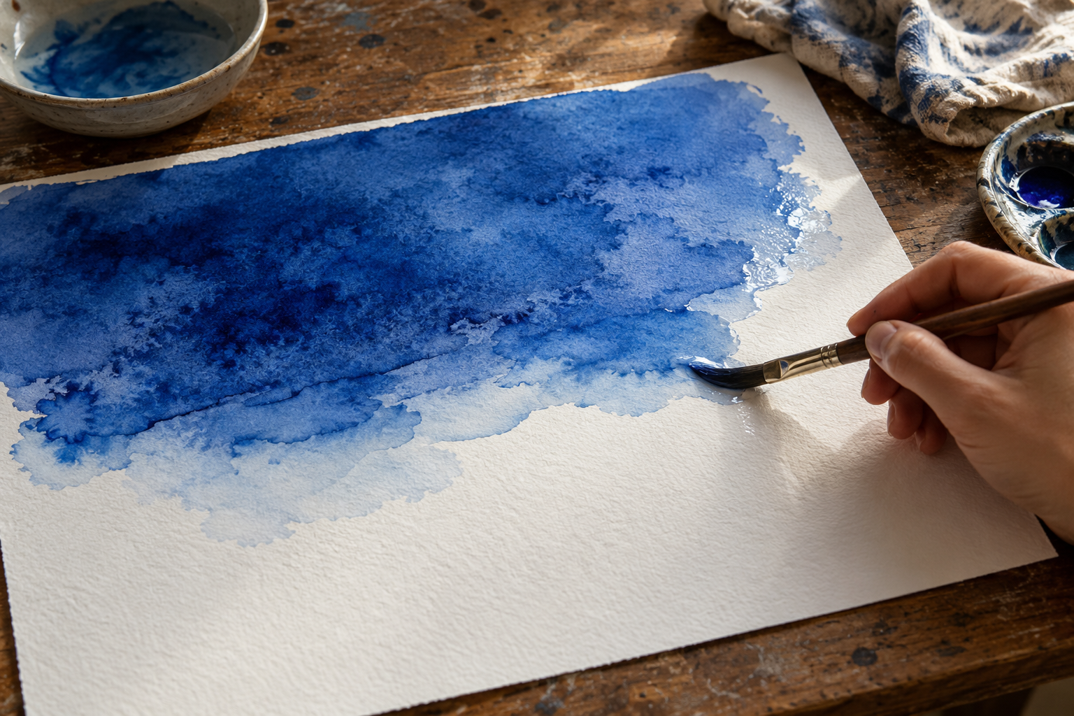
On the page, the brush spreads a suspension of particles over a surface with its own texture and absorbency. The liquid moves; pigment can settle into hollows or remain in a smoother film. Winsor & Newton's granulation guide describes a stronger textured effect on rough paper, where particles collect in the surface's low points. Schmincke's Horadam colour guide likewise says water quantity and the substrate affect its granulating mixtures. These are maker explanations, not universal predictions for a named pigment. The same tube can give a quiet wash on one sheet and a mottled one on another.
The manufacturer's chart has other columns for a reason. Winsor & Newton explains that its watercolour table separately records opacity, permanence, lightfastness, granulation and staining. Those words describe different questions. Opacity concerns how much of the paper or lower layer shows through. Staining concerns how fully a dried colour can be lifted. A pigment list cannot replace the tests behind a maker's lightfastness claim or tell a painter exactly how a wash will lift from a chosen paper. The columns should be read together, and their rating methods should be checked when a work's longevity matters.
A label can change while a colour remains
Paint lines are not fixed forever. Schmincke's July 2025 product notice says it changed its Horadam Indian Red from a PR101–PR206 mixture to PR101 alone, while aiming to keep the visible colour nearly unchanged. That is a particularly revealing case: a pigment list changed while the maker tried to preserve the familiar name and appearance. A tube bought years later may therefore require a fresh look at its label even if it comes from the same brand. The notice records this one reformulation; it does not prove a general rate of recipe change across paints.
How should a painter choose between the three Burnt Siennas? Start with the code, because it catches substitutions that the front name hides. Then make a small comparison on the paper intended for the painting. Lay each paint as a strong mark and as a pale wash. Watch whether the particles settle into the texture, whether an edge dries evenly, and how a patch responds to gentle lifting after it is dry. Try the mixture in which the colour will actually be used. This is a studio test of handling and appearance, not a replacement for controlled lightfastness testing. It helps reveal the differences that matter to this brush and sheet.
The name Burnt Sienna points a painter toward a region of colour. The code narrows the ingredient question. Neither can show the whole wash in advance. For that, the pigment has to leave the tube, meet the water, and cross the particular paper where the picture will be made.

A thought worth keeping?